| Table of Contents |
A graphical presentation of two related variables can enable you to see what the form of their relationship is. For this purpose, all graphs can be divided into two kinds: those that are straight lines and those that aren't. The point is that the eye can recognize a straight- line graph quite precisely, while it isn't nearly so sensitive in distinguishing between different classes of (other) curves. Thus if the relation you are looking for is a linear one, or if it can be made into a linear one by transforming the variables, you can spot it directly on a graph.
As an example, consider the projectile motion experiment we looked at in the last section. The motion in the y-direction is accelerated by the earth's gravity, so we expect it to be given by
![]()
(The signs are positive here because y was measured downward.) The relation of y and t is quadratic, rather than linear; but it's the linear form that's easy to recognize. Then can we transform these data in such a way that the expected relation is a linear one? If we let
![]()
 ...then
a graph of w vs. t should be a straight line, with a slope g/2.
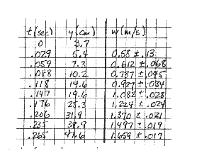
The experimenter's data are reproduced at right, and a graph of w vs.
t appears in Fig. 7 below. The points are seen to be a good fit to
the straight line, so the quadratic dependence of y on t
is confirmed.
...then
a graph of w vs. t should be a straight line, with a slope g/2.
The experimenter's data are reproduced at right, and a graph of w vs.
t appears in Fig. 7 below. The points are seen to be a good fit to
the straight line, so the quadratic dependence of y on t
is confirmed.
(Notice here the importance of knowing the error limits on your data points. Without the error flags, the data of Fig. 7 would seem to indicate an upward curvature for the first few points. The error limits are derived from those estimated on measurement of y and y0; again, we postpone until the next chapter the problem of how you calculate them.)
What we've done is to extract g from the projectile data of Fig. 7 by finding the slope of the graph. This procedure is enormously useful, as it very often happens that the experimental result you are looking for appears as a parameter of a curve you determine graphically, such as the slope or intercept of a straight line. This is especially true since, as we will see shortly, many different functional forms can be perverted into linear graphs.
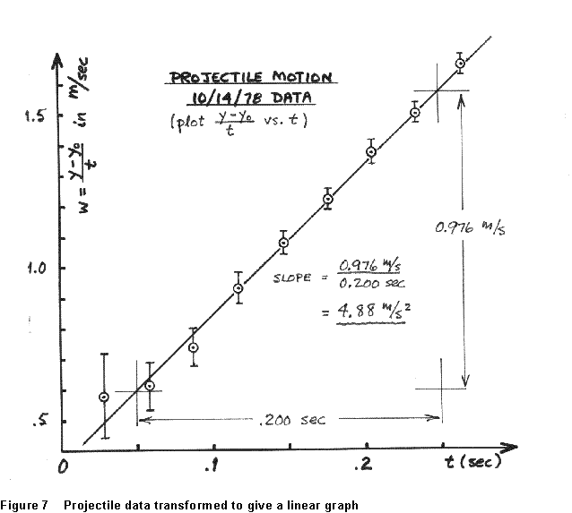
It does have some limitations, however. For one thing, the precision with which a graph of any reasonable size can be drawn, or read, is limited. If I wanted to get g to within 0.1% from the data in Fig. 7, I'd need a graph a few meters on a side -even if my data were perfectly precise. Another thing is that there's always some leeway in how you draw a curve through a real set of data points. I could draw other lines through Fig. 7 that give a plausible fit to the data, with slopes of perhaps 4.88 or 5.05 m/sec2. There's apparently no objective way to know what value, within some range, is the best choice, and no unambiguous way to assess the uncertainty in the value I choose.
It turns out that there exists an analytical procedure for finding the best straight line that can be drawn through a given set of data. I'm just going to state it for you; it's worked out in any introductory treatment of error analysis. (Deriving the procedure isn't hard, but defining "best" is a little subtle.)
Given data (x1,y1), (x2,y2), (x3,y3),..., I want to pick constants m and b such that the straight-line graph
![]()
is the best possible fit to the data. If the uncertainty in each individual y-value is the same, I get
![]() and
and ![]() (1)
(1)
 where the bar over
a quantity means the average value of that quantity over all the
data. As an example, consider the data plotted in Fig. 7, a straight line
of the form
where the bar over
a quantity means the average value of that quantity over all the
data. As an example, consider the data plotted in Fig. 7, a straight line
of the form
![]()
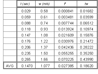
The data and calculated quantities needed for (1) are given in the table at right. Applying (1) with corresponding variables, we get for the slope
![]()
![]()
and for the intercept
![]()
Thus the best straight line that can be drawn trough these data corresponds to a measured value of g = 9.67 m/s2; this is almost the same as the value we got directly in Figure 7. Much of the difference is due to the fact that, when I drew the line in Fig. 7, I gave less weight to the first couple of points because of their relatively large uncertainty. The best-fit recipe assumes all the data are equally uncertain, and thus draws a line with a slightly smaller slope. One can modify the best-fit procedure so that it "weights" some points more heavily than others applied to these data, the weighted best fit gives 9.96 m/s2 but we needn't get into that here. In any case, the value of g (the acceleration due to gravity) that we get 9.76 m/s2 or 9.67 m/s2 is in fair agreement with the accepted value (9.807 m/s2 for our location).
The "best fit straight line" is a very standard procedure in data analysis, and it's available in all sorts of places. On a PC, there are straight-line fitting toosl inany full-featured spreadsheet. Some scientific calculators have the procedure hardwired. You should spend the time to do all this number-crunching yourself once or twice, to make it real in your mind; but after that, ask a machine.
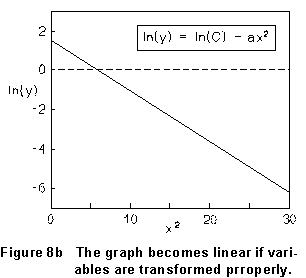
The trick we used in developing Figure 7 is to transform the data so
that an expected relationship becomes a linear graph. We can use
this to test for many sorts of simple dependences. For example, suppose
two variables (x and y) obey
![]()
as graphed in Fig. 8a.
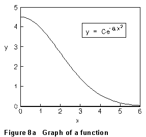
But if the data is transformed by plotting the natural logarithm of y vs. x2, this relation becomes
![]()
...which is a straight line with slope (-a) and intercept ln(C), as illustrated in Fig. 8b.
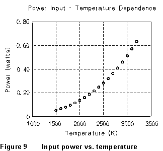 As a further
example, consider the data that are plotted in Figure 9. These show the
electrical power input to some imaginary system as a function of ambient
temperature. A glance at the figure tells us that the dependence of power
on temperature is not linear; a smooth curve drawn through the points has
marked upward curvature. We can try other simple relationships to see if
they give a good description of these data, by graphing them in various
ways. For instance, we might suppose that the dependence of power on temperature
is exponential:
As a further
example, consider the data that are plotted in Figure 9. These show the
electrical power input to some imaginary system as a function of ambient
temperature. A glance at the figure tells us that the dependence of power
on temperature is not linear; a smooth curve drawn through the points has
marked upward curvature. We can try other simple relationships to see if
they give a good description of these data, by graphing them in various
ways. For instance, we might suppose that the dependence of power on temperature
is exponential:
is ![]() ??
??
If so, then ![]() and
a graph of ln(P) vs. T should be a straight line with slope
b.
and
a graph of ln(P) vs. T should be a straight line with slope
b. 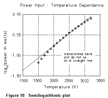 This is
tried in Fig. 10. (Notice that this is just the same as plotting P vs.
T on "semilogarithmic" graph paper, on which the vertical
scale is logarithmic rather than linear.) But again, the graphed points
show a distinct curvature, so the data are not consistent with the
supposed exponential dependence.
This is
tried in Fig. 10. (Notice that this is just the same as plotting P vs.
T on "semilogarithmic" graph paper, on which the vertical
scale is logarithmic rather than linear.) But again, the graphed points
show a distinct curvature, so the data are not consistent with the
supposed exponential dependence.
Another possibility that is easy to check graphically is that the dependence of P on T is a power law:
is ![]() ??
??
If so, then ![]() and
a graph of log(P) vs. log(T) will be a straight line,
whose slope is the exponent n.
and
a graph of log(P) vs. log(T) will be a straight line,
whose slope is the exponent n.
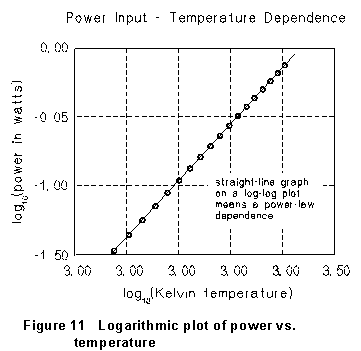
Trying this gives the graph shown in Fig. 11. The trend of the data is
in complete agreement with the straight line drawn there. We can conclude
that the resistivity does depend on the temperature according to a simple
power law, with exponent n = 3.27. (And this is equivalent to graphing
P vs. T on "log-log" paper paper with both scales logarithmic.)
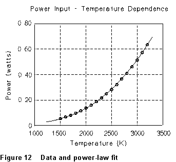
From a graph like Figure 11, the straight line drawn is easily found to
have slope 3.27 and intercept - 2.21; so the dependence of P on
T is a power law with n = 3.27 and A = 0.0062. This
power-law dependence is compared with the original data in Fig. 12.
We see that by drawing appropriate graphs we can often see what kind of
relationship there is between two experimental variables, with little or
no calculation. What makes this trick work, again, is the fact that it
is relatively easy to distinguish, by eye, whether or not a set of points
fall on a straight line. I'll leave it to your imagination how you might
unravel, graphically, more complicated forms.