| Table of Contents |
Most lab writeups will require graphs of some sort. The reason is that a graph presents the relation between two or more variables far more expressively than mere lists of numbers can; one looks at a graph and sees the relationship as a whole. If you'll bear in mind, whenever you draw a graph, that this is what it's for, the rules and conventions for preparing graphs make more sense.
To begin with, one makes a distinction between independent and dependent variables. The idea is that you are free to choose the value of the independent variable, and the value of the dependent variable is determined by it. (In an experiment, typically you set the value of one variable, and measure, directly or indirectly, the value of the other variable that results from what you've set. In some cases there's a real physical distinction; in others, it's more a matter of convenience than anything else.) By convention, the independent variable is plotted on the horizontal axis, and the dependent variable on the vertical axis, of the graph.
Scales should be chosen to spread the range of each variable over a large part of the page. It isn't always necessary that the origin appear on the page: if x varies from 2.84 to 3.27, then running the scale all the way from x = 0 would squadge all your data points at one end of the page, and your graph wouldn't tell you much. In this case, you might let the x axis run from 2.80 to 3.40, or something.
Also, you should choose scales such that the divisions on the graph paper correspond to simple fractions, for ease of interpolation. That is, from x = 2 to x = 3 might cover 5 or 10 or 20 divisions, or some such, but not 3 or 7 or 15 divisions. The scales should be clearly labelled, including the units of the quantities being plotted. The point of all these is just to make it easy to see, looking at the graph, what relationship exists between the variables.
The data points you've plotted are what the graph is for, so they need to be easy to see. Thus you emphasize them somehow, so they don't get covered by lines, or mistaken for bits of crud in the paper, or otherwise lost. Draw a circle around them, or an "X" through them, or some such. Then if more than one set of data must be plotted on the same graph, you can distinguish them by using different symbols.
 What do you think
about the graph in Figure 3? It shows some data (tabulated to the left)
that were taken in a PH125 experiment on projectile motion; the actual
data are tabulated at the left. Motion in the x direction is unaccelerated,
so we expect the relation between x and t to be given by
What do you think
about the graph in Figure 3? It shows some data (tabulated to the left)
that were taken in a PH125 experiment on projectile motion; the actual
data are tabulated at the left. Motion in the x direction is unaccelerated,
so we expect the relation between x and t to be given by
![]()
Thus a graph of x vs. t should be a straight line with slope vx and intercept x0. This is probably what we are plotting the graph to find out!
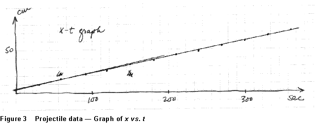
Well, what about Figure 3? Certainly the data points are consistent with a linear relationship between the variables if one can find the data points. Even this isn't all that easy, however, and nobody but the guy who drew it will know what the graph is, or what the variables are, or why the graph was drawn, or what the slope signifies. As an expressive presentation of the relationship between x and t, this is less than a complete success!
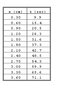
Without very much extra effort, the relationship might have been presented as in Figure 4 (below). This time, the vertical scale used is large enough to make the variation in x more visible; the quantities plotted on the axes are labelled, with units; the data points are emphasized; the graph is titled, and the location of the data from which it was drawn is referenced. An indication of the experimental uncertainty is given on the graph. Now there is no doubt about what the graph is for, or about the conclusion being drawn from it that the variation of x with time is indeed linear. This being the case, the slope of the line is vx; the intervals of "rise" and "run" from which the slope is calculated are clearly indicated, and the calculation is shown, with units.
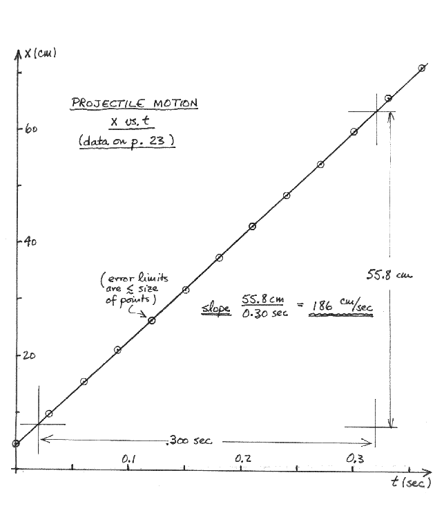
Figure 4 Projectile motion -- the same data as in Figure 3
The fundamental question you are trying to answer when you draw a graph is what, if any, simple relationship exists between the variables plotted. And your graph is a success if and only if just looking at it makes the answer to that question clear. In these terms, Figure 4 is a successful, a useful, presentation of these data; Figure 3 was not.
The question of what relationship exists between the variables of a
graph cannot be answered without some sense of how precisely the values
of the variables are known. Thus it is almost always appropriate to indicate,
somehow, limits of error for one or both variables on the
points you plot.  For
instance, consider the data graphed in Fig. 5. What is the relationship
between these variables?
For
instance, consider the data graphed in Fig. 5. What is the relationship
between these variables?
If these are experimentally measured quantities, you cannot answer without knowing how well x and y have been measured. The same data are plotted again in Fig. 6, but with experimental error limits on the values of y. If the experimental errors are as large as in Fig. 6a, most of the observed variation in y could be due to experimental error; about all you can be sure of is the upward trend of y with increasing x. On the other hand, if, as in Fig. 6b, y is known much more precisely, you are justified in concluding that much more of the observed variation is "real."
If the error limits are no larger than the size of the points you plot, then a note to that effect is enough. This was the case in Fig. 4. Otherwise, it'll make the graph clearer if you indicate the error limits on one or both variables, as has been done in Fig. 6.
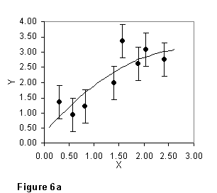
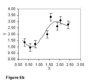
The relationship you are justified in inferring between x and y depends on how uncertain your values of y (and perhaps of x) are.
Even if, in the data of Fig. 5 and 6, the uncertainty in y were smaller than the size of the points, you would still draw a curve something like that of Figure 6b through them, rather than "connect the dots". The point is that it is never good practice to let a single data value determine the character of a substantial part of your graph; if in fact you believe that all the variation in the data of Fig. 6 is real, you should TAKE MORE DATA so as to nail down the details of the curve more clearly.